Using White Space In Graphic Design
I never had an imaginary friend growing up, but now that I’m a graphic designer, I have one always by my side: white space.
White space is an intriguing design tool because it is there yet not there—like an imaginary friend. It won’t ask to borrow money, it won’t leave dishes in the sink, and you can always count on it to make your designs look their best.
Known by several other names such as negative space and active white space, using this technique effectively can help glue your design together, give the eye a space to rest, and create visual harmony.
So, let’s dig in.
Try this experiment: open any magazine or newspaper, and notice how jam-packed the pages are with text and images. Rarely is there any unused space in these layouts.
Why?
It’s simple. Publications such as these are ad-driven, which means there are financial motivations to fill in as much space in the magazine as possible.
Now, the next time you are out and about, notice billboards, bus ads, or posters. More than likely, these pieces employ an effective use of white space. With ads like these, designers know they have a precious few seconds to both catch attention and deliver their message.
In these cases, the ‘less is more’ philosophy comes into play. Four words and a perfectly curated graphic will do the job much better than a jumble of words and images that jam up the piece.
I always bring this same technique to pieces such as business cards, display booths, and even websites to create eye-catching graphic design pieces that effectively communicate while looking their best.
Let’s take a look at a few examples.
In this trade booth design, I used white space to offset the logo in the diamond shape and to separate the tagline at the bottom. The logo stands out because the space around it is uncluttered—there’s no mistaking what business is being advertised.

In this website example, white space lends a classy feel to LexiLu’s high-end jewelry e-commerce site.

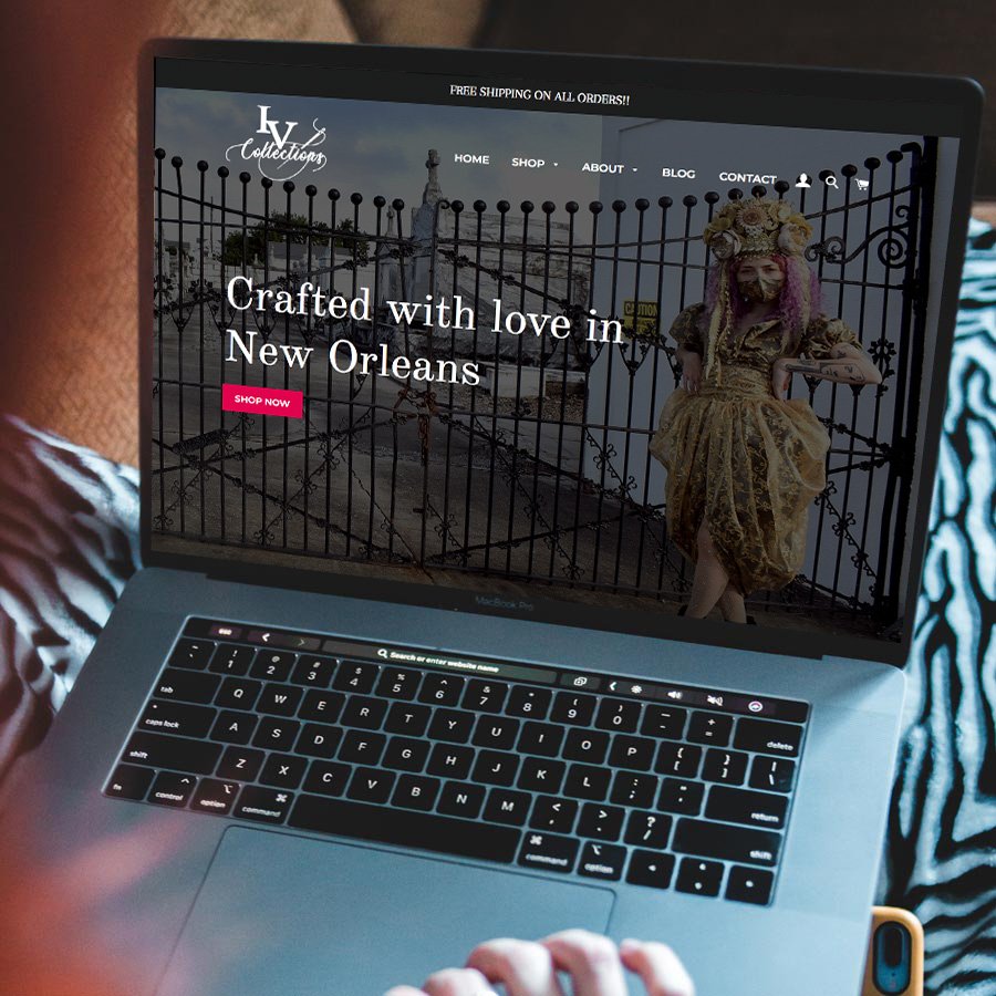
It also helps to bring a sense of elegance to IV Collection’s homepage. Note here that white space doesn’t literally mean white space, as in the color white. The dark space around the ‘Crafted with love’ tagline helps to make it jump off the page.
And on the Harper McNeil homepage, using this technique helps to offset the navigation, bring attention to the logo, and create a sense of high-class design for this financial industry consultancy.

Lastly, let’s look at a few business card designs. For the Haik Billiot card, white space again brings a sense of thoughtful elegance to the piece.


For Elspeth’s Airs, white space at the top of this card helps to frame the ‘Fragrant touchstones’ tagline.
I hope you’ve gained the confidence to now design with white space. I encourage you to experiment with this technique and to always make it your design companion. Just don’t expect it to be there when you need to borrow money.
As always, Happy Designing!
Jon
P.S. I am available for one-on-one consultations and instruction in graphic design. Contact me for more information.
*Created without the use of AI

About Jon Hébert
I’m a former newspaper editor, radio DJ, art director, and rock n’ roll front man who ventured into graphic design as a hobby. After receiving my art and design degree from LSU, I worked at several marketing firms before opening Jon Hébert Creative in 2003. I’ve since helped hundreds of clients with their graphic design, digital strategy, storytelling, and more. I’m also a musician and writer.